When you log into Affluent you'll be taken to your Home page, the Account Overview, which is part of what we call "standard reporting". It is standard as opposed to the Reports and Dashboards which are highly customizable.
The Account Overview is a high level overview of all the data you have permission to access. For Admins it will be an overview of the performance of every brand, account and platform connected. For users with access to only certain brands it will be a summary of those brands.
From the Account Overview you can drill down deeper into the data. You can view anything from the performance of the agency over the last year, to the performance of a specific campaign in a specific country for just last week.
Overview
When you first look at the Account Overview you'll see key metrics, a revenue and clicks graph, and tables with high level performance data for date, brand, and publisher. From here you can click on any link in any table to drill down in to greater detail.
For example, if you click on a brand in the brand table you will be taken to an overview for that brand, with tables showing performance by additional categories such as country, promo codes, creatives etc. From this page you're able to drill down even further by clicking on any of the links in the tables or using the sub navigation menu under the brand's name.

Date Range Selector
In standard reporting the date range is determined by the date range range selector in the top right hand corner. You can choose from a preset date range, such as last week, month to yesterday and last year, or you can set a custom date range.
Using the date range selector you can also set Affluent to 'compare' date ranges. This allows you to see data compared to "previous period", "previous year" or "custom."
Note: The date range you choose will stay with you for the session, in a new session it will revert to the previous 30 days.
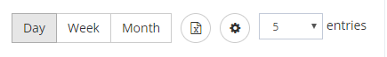
Date Range Grouping
Where you see the "day, week, month" toggle you can choose how to group your data. This option is available in standard reporting where the data is arranged by date, for example in the line graph and in the tables.
Grouping by week or month can be useful when you are trying to spot trends over time.
Customizing Metrics
In standard reporting the data displayed is set to the default metrics, for example to the key metrics chart shows: Net Revenue, Net Total Commission, Clicks, Sales, Productive Publishers, Active Publishers, CPA, and ROAS.
You can edit the metrics shown anywhere you see the cog icon ![]() on the right hand side next to the Export to Excel button
on the right hand side next to the Export to Excel button ![]() . Clicking the cog button will open a Customize Key Metrics window where you can select the metric that you would like to see. You can select up to eight for the Key Metrics chart and you must select a minimum of three for the tables.
. Clicking the cog button will open a Customize Key Metrics window where you can select the metric that you would like to see. You can select up to eight for the Key Metrics chart and you must select a minimum of three for the tables.
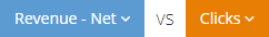
To customize the metrics on the line chart, you can use the blue and orange buttons in the top left hand corner of the chart. When you click on either a drop down menu (with a search bar) will appear. When you select a new metric the chart will automatically update.
You can reset the metric by selecting "Reset to default" in the customizing metrics pop up window.
Note: Changes to metrics will update your account preferences (and will stay beyond your current session).
Exporting Tables
You can use the export to Excel feature for all the tables in the standard reporting. Anywhere you see the Export to Excel button, next to the day, week, month grouping, you can export that table to Excel. Simply click the button and it will automatically download. For large downloads, you will have the option to have the export emailed to you, so that you don't have to wait for too long. The key metrics and line graph cannot be exported to PDF from standard reporting but they can be easily recreated in custom reports.

Searching
The search bar in the top left hand corner of the platform can be used to search your data for publishers and brands.