Combo charts have both a line chart and bar chart plotted on one graph, this is great for when you have two different sets of data that you need to show on one graph. For example a combo chart can show net revenue as a dollar amount and RoAS are a percent, over time.
To show your data in a combo chart, select "Combo Chart" from the drop down menu under the title of the report.
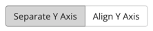
You have the option of choosing from two different groupings when displaying your combo chart: "Separate Y Axis" or "Align Y Axis". You can find this toggle in the upper-right hand corner above the chart.
You would most likely use "Align Y Axis" when you want to compare two different data types on the same scale. This enables you to draw relationships between the data more easily:
Combo chart not what you're looking for? Check out the other options: