Whether you want to see a brand's performance over time, a pie chart of top performing promo codes, or a table that breaks down performance per day, per brand, per publisher for US mobile traffic, reports are what you're looking for.
Reports can be as detailed or as big picture as you like. Add in categories, metrics, filters, and change the date range as you want.
Reports are the individual tables or graphs that you add to Dashboard to create brand or client reporting.
- Step 1 - Creating a New Blank Report
- Step 2 - Choosing a Report Type
- Step 3 - Adding Data to your Report
- Step 4 - Running a Report
- Step 5 - Saving a Report
- Additional Articles
- Video Walkthrough: Creating Reports
Step 1 - Creating a New Blank Report
- To get started, click on "Reports" in the left hand menu. This is where you create new reports and access existing ones.
- Click the "+ Create New Report" button. This will open a new blank report.
Step 2 - Choosing a Report Type
Affluent currently supports the following report types; table, line, bar, pie, combo key metrics, and special reports that includes events table ad event timeline. The different report types allow you to select the best way to show your data so that it can be easily understood and interpreted.
To change the report type click the Table drop down on the left hand side and click on the report type you would like to use.
Different report types support different amounts and types of data. Tables can contain multiple categories and metrics. Pie charts can only include one metric. Event tables and timelines only show data uploaded via Events.
Step 3 - Adding data to your report
To add data to your report, you will need to select "Categories" and "Metrics" and "Filters" which will dictate what data appears in the report.
Categories
If you think of a table, categories correspond to rows and generally answer the question "which" (e.g. Which publisher? Which client?). For example, if you wanted to see a table of net revenue for all your clients, you would select Brand as the category.
Metrics & Metric Variants
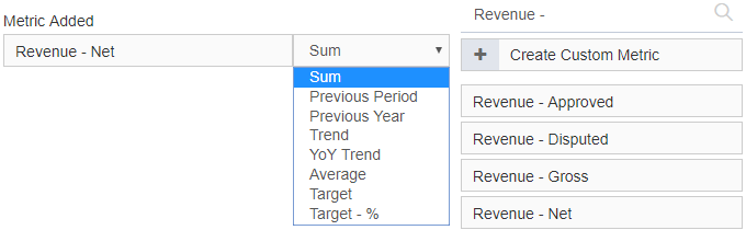
Metrics correspond to columns and show values. Following the previous example, for metric you would select "Revenue - New". To include a metric drag and drop it from the right over to the left.
Not all Categories support all Metrics, for example the Category SKU can only show SKU related metrics i.e. SKU Quantity, SKU Commission, SKU Revenue, CPA and RoAS.
Many metrics allow multiple variants such as sum, average, trend, and YoY trend (year over year). If you have set up Targets, you can also select Target or Target %. Metric variants will only show in the drop down if they are supported by that metric.
Filters
Filters allow you to include or exclude data from categories. For a simple example, consider a table with publishers as the category and net revenue as the metric, this will show you all your data for all publishers across all brands. If you only want to see data for one brand you can apply a filter to to include only that brand.
Date range
The date selector in the top right hand corner allows you to alter the data shown in the report by date. You can choose from Preset Ranges such as yesterday, last month, or year to date. Or, you can select a custom date using the calendar.
Select "Compare to" to show data from two different time periods in one report. You can compare to the previous period, previous year, or select a custom range. When in date comparison mode there will be two sets of date boxes in the date range selector. Currently you can only show data from two date ranges at once.
Step 4 - Running a report
Once you have selected the categories, metrics, and filters for your report click "Run Report" on the right hand side. After making any changes to a category, metric, or filter always click "Run Report" to update the data. (You'll notice the Run Report button will be underlined in orange if you need to click it)
Step 5 - Saving a Report
Naming a report
On the top right click "Untitled" to name the document. If you want to use the report as a template or in multiple Dashboards give it a descriptive rather than a client specific name e.g. "Net Revenue Report", not "Dunder Milffin's Revenue Report."
Saving
To save the report, click "Save" next to Run Report. Remember to save the report regularly, and before you leave the page. "Save As" allows you to make an additional copy of a report, for example if you've made changes but don't want to lose the original report.
User access
All new reports are initially created as "Private" and "Locked" (see below) which means they can only be seen and edited by the owner. To change this use the globe and padlock toggles.
If you set the report to "Public" all users in the organization will be able to see and edit the report. If you "Unlock" the report, all the users in your organization will be able to see the report, but they won't be able to edit it.
We highly recommend making your report "Public" but leaving it locked. This means everyone will be able to view it and make copies of it but won't be able to change anything on it.
Additional Articles
Once you've created a custom report you can use it to build custom dashboards. Check out the "Getting Started with Dashboards" article to find out more about dashboards. The most important thing for now is to know that custom reports are the building blocks of custom dashboards.
Video Walkthrough: Creating a Report - Basics:
Video Walkthrough: Creating a custom report - Performance by Month
Here's a demonstration of how you can create a brand specific report to display a few key metrics, broken down by month. It also shows how you can add a comparison (to the previous year) to the report.